Monday, January 18, 2021

Art Journal Planner Page

 Hello Topflight Stamps Fans, I am working on a Mixed Media planner page today. These techniques could also be used for a card, an art journal page or canvas. I will probably use this in my December Daily as a start to the New Year. *Affiliate- some of these companies have given me product to use, play & experiment with. The ideas are my own but I tend to work with companies whose products I like so enjoy the inspiration.  **some of these links are affiliate, I receive a small percentage from the company at no cost to you. This helps me deliver free content!


This page has multiple layers that add up to a lot of eye candy. I used PaperArtsy products, Seth Apter stamps & embossing powder. It was so nice to just sit down and get ink on my hands.


Let's get started

Layer #1: Layers of paint. Using watercolor paper that was then covered with a layer of gesso. You could also use card stock. I cut my page using Elizabeth Crafts Designs Planner Essentials. A supply list with links is at the end of this post. Also if you use my code karenbearse on the Topflight Stamps site you save 10%.  

 
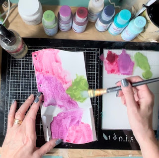
Layer 2: The idea is to do a layer of paint & then wipe away some of the colors with a stencil pattern. The gesso is what makes this technique work. Using Fresco Finish paint do a watercolor type background. Dry the paint a bit but you still want it kind of wet. Place your stencil down & use a baby wipe to pull off some of the paint.
 
 
Practice this technique on scrap papers 1st until you get the hang of it. I just wanted a sketchy look so I wasn't too careful pulling the paint up. 
 
 
Layer 3: Next add layers of paint with stamps. Be sure to wash the paint off your stamps right after to protect your stamps. 
 

Layer 4: Add some embossed stamped images. In this case I used 1 of each of the colors in Seth Apter's trio set, using his circle stamp. They turned out so cool! 
 

Layer 5: The title was from the same set. I really like Seth's last release for this reason. It includes background, focal & title stamps all in one set. The word now was heat embossed with Crusty Copper, one of my go to embossing colors. It was stamped on a bit of patterned book paper & then cut out. 
 

Layer 6: This title was covered in clear emboss using Glistening Glass & heat set. I did not get the emboss uniformly on the edges. To achieve this look don't press the embossing ink perfectly at the edges. The powder won't adhere in those spots. Once cool the edges were distress with ink. The color hits the paper but wipes off easily where the embossing is. This piece was mounted on black card stock to help it pop & give it some stability. It was adhered to the background with foam pad adhesive. 


Layer 7: Add a quote. I love Art by Marlene's quote stickers there is one for almost every occasion! A it of doodling & my page is done! Thanks so much for joining me today, I hope I could inspire you to get some art done. 

Supplies: 

Tuesday, January 5, 2021

Eileen Hull Post Box- Full Tutorial

Hello Blogland, wow the 1st week in 2021. How ever did that happen? Hopefully you have made it to this year relatively unscathed and are ready to enjoy some art time. This month Eileen's teams are taking on all things card. I don't really make cards in the traditional way but I do enjoy making art cards. They come in different sizes like ATC of a size that will fit onto other art journal pages. I also love making cards that fit into Eileen's various boxes. 


Today my tutorial will be making this wonderful vintage Post Box to store some of the cards I make. The cards that fit in the box perfectly are 3x4". Also * hot tip before you start plotting paper, ink & ephemera, figure out your closure. Some need to be added before the box is assembled.


Grab Your Die-cut! 

I experimented by making this box out of card board & was not overly happy with the result. The mat board is just so much stronger & so much better for making these structures which, let's face it, need to be built to last. To make the directional paper work for me, cutting the paper separately seemed a good idea. I used Tim Holtz paper from his 8x8 Collage Pack. The images are smaller & worked perfectly for this project. I used easy cut adhesive to attach my papers. Strong, simple to use & wrinkle free.
 
 
This Post Box cuts in one piece and assembly is super simple so it really is easy & fun to make these. For the inside I chose this airmail style pattern paper. To shape the lid pieces simply run your paper through the die-cut. Cutting the pieces into 3 makes the box bend easier. Simply cover the cardboard that shows with paint, marker or washi tape. 
 
One of my favorite techniques to use in any project, book etc, is to paint, stamp & emboss. This combination was used to color the sides of the box. Matching my project paper is Distress Paint in Candied Apple. 

Once the paint was dried random stamping & a few pieces of ephemera were added. This is coming together well. Remember it is easy to duplicate this project in any style just by using different papers & ephemera. 
 
Here is a photo of the box as I build it. You can see that I am cutting and adding the paper as I go which makes it easier to make sure the paper right way up! The sides of my box also have that layer of Glistening Glass emboss powder which make it look so good & give it a finished look. Seriously love that embossing powder.  


Time For a Title

What an original & unique title! Sometimes it makes sense to go with the obvious. I cut the letters using the die-cut Classic Upper from card stock. Hot Tip: use a heavier card stock or layer a few pieces of paper together. These were embossed with Golden Rod, so metallic shiny!


Adding the elements as I build the box is the best part! However I always seem to forget to...


Figure Out The Closure!!

The downside to forgetting the closure is the project stalls out while I imagine, figure out or wing some kind of closure. The upside is, quite often I come up with a new way to do it. I ended up tying hemp through 2 holes in the cover to make a loop. 
 
 
The key is attached to the flap with a brad & slips into the loop to hold the flap closed. As I had already put the inside paper on, the back of the brad shows through. The perfect solution is this stamped image to cover it up.

Pretty simple idea but I really like how it worked out. Just had to poke 2 holes and tie knots on the inside of the flap, creating a loop. 


I added Red Line tape over the holes to create a really strong hold. Washi tape was put on top of this and then decoupage glue so the cards won't get stuck as they are put in and out of the box. All that was left was to adhere the side flaps together to finish up the box. 


That is it for today, Eileen has this project or I would add in a side shot but for now I leave you to go get inky!!

 Supplies: 

Monday, January 4, 2021

3 Tag Backgrounds with Infusions

Hello Blogland, today I have 3 tag backgrounds for you using PaperArtsy Infusions. First I hope you managed to find joy your holiday season. I wish you & yours, peace, happiness & health in the New Year. As this pandemic rages on, I pray the vaccine brings miracles of healing to the world. All I can offer today is a bit of distraction with some crafting. Remember the coupon code karenbearse gets you 10% off at TFS  *Affiliate- some of these companies have given me product to use, play & experiment with. The ideas are my own but I tend to work with companies whose products I like so enjoy the inspiration.  **some of these links are affiliate, I receive a small percentage from the company at no cost to you. This helps me deliver free content!


I really wanted to play with no finished project, just some ideas to get a start. I think wading carefully into the New Year 2021 is a good idea. Here are my 3 different background techniques to get you going. You can find all these supplies at Topflight Stamps. I am thrilled to be continuing on with this wonderful group of creatives for another 6 months. I hope you check back often to see my shenanigans. 

Background #1 & my favorite: Use a spray adhesive to stick your stencil down onto your surface. This tag uses a mixed media type paper which lets the product have some time before it dries. 


With the stencil stuck down, add powder. Infusions are pigment color with walnut crystals. The powder can be activated with anything wet. Try experimenting with gesso, decoupage glue or other mists. I am using a water spritzer today. For this tag I chose to keep the colors separate. Spritz with mists of water activating the powder. Using a finger, gently move the color being careful not to move the stencil. If you want to take it one step further, you could use a paint pen to make the stencil lines more crisp. 


Background #2: This is a 2 step background. First add a few colors of powder & spritz with water, use your finger to move the color & blend it. I only used 2 colors (Lemoncello & Royal Blood) but feel free to experiment. Dry & then move on to #3.


Background #3: The main reason for this background was to get the powder on the stencil for #2. Place stencil down & put a nice layer of powder, a little goes along way (Black Knight). Spritz with mists of water. I was surprised at how crisp the stencil image turned out. It makes sense though as I did not put too much water or move the product around. Blurry stencil images happen when the product goes underneath the stencil. 


Next take background tag #2 (left side) and flip the stencil over from #3 (right side) while still wet & press down on the tag using a paper towel. If the powder has dried simply spritz the stencil with water to re-activate it. This will transfer the image onto the tag, basically using your stencil as a stamp. The paper towel helps the image from bleeding and makes it crisper. 


Finished tag #2. That is it for today! Thanks so much for joining me. I hope you have the chance to try out these backgrounds. They are great for tags, cards or art journal. Have a wonderful week & stay healthy. 

Supplies:  


LinkWithin

Related Posts Plugin for WordPress, Blogger...