Hello My Stampy Friends! Welcome to my last post for Topflight Stamps. After 2 1/2 years with this awesome team it is time for me to move on. Life has gotten super busy & just does not leave me time to continue. This has been a wonderful experience. The gals on this team are super supportive & friendly. It has been a pleasure to play with so many, wonderful, stamp company products & get inky on my Mixed Media Mondays. A special thanks to Donna Bowman for creating this creative space for us to play in. Lisa Hoel thanks for hanging in with me when things went pear shaped! You are a wonderful DT Lead.

Now on to my project! This week the team is focusing on the UK company Visible Image. I made a Full Size Journal a while back & decided I wanted to add a signature for some arty play in January. I will show the journal & link to it below. I love how this booklet turned out. It some of my favorite elements. Texture, a metallic shine, cool quotes. Hum I may have to add some metal LOL.
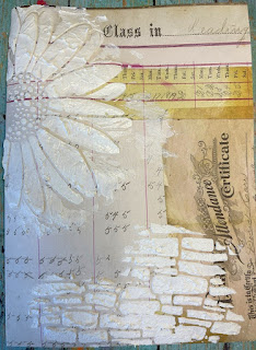
This booklet started with a 12 x 8 1/4 sheet of scrapbook paper from a Tim Holtz paper pad. Pulling out a few stencils, some Grit Paste (bricks) & crackle paste Daisy) was added. Then the page was set aside to dry.

Next up: Pulled out my Gel Press to use as a palette. This is a great way to not waste paint & if you want to brayer your background. At the end of your session you can pull a print so the left over paint is used up.

Here is the brayer painted background, with my main title "Escape From Real Life". I know many of us are feeling this now more then ever, art is such a great escape & good for our mental health. Colors used are London Bus & Truffle. Looking at my Infusions swatch was the next step. This helps to figure out what colors the project options are.

Once the pastes were good & dry it was time for color. Adding Infusions in Lemoncello & Golden Sands with some water gave my Daisy a dynamic yellow, golden brown look.

For the brick area powders, In the Navy & Sleigh Blue were used. Lovely & grungy. It is crazy how realistic this brick will look when finished.

I had this idea & wasn't sure if it would work but that is sometimes the best way to discover new techniques. The idea was to have some of the art quotes embedded in the background using clear &/or white embossing. I made a couple of samples to see which I like better. Below is the same technique I used for the left hand side sample.

Also realized there was more success in seeing the quote if the starting background was light with a darker color on top. This creates more of a contrast making it easier to see the quote. This has a watered down Sleigh Blue underneath, then clear embossing powder & Royal Blue on top. Once the Infusions are dry, clean
off the embossed area well with a baby wipe. If you
use a heat gun to dry, the emboss heats up again and you may lose your
image. I didn't end up using this & learned this technique works better with a crisp, well defined image like the Art is in my DNA.

I had to show this luscious piece of mixed media paper that is covered in the various Infusion colors. Just so nummy!

In the process of that I realized the torn quotes made me happier. Totally different look then I envisioned but really like it. This is the fun part of art, changing your decisions as you go. This quote background is from a piece of the paper in the last photo, above. The quote was stamped in Roasted Coffee ink & embossed with Lime which is a translucent embossing powder.

Do you ever have a product or technique that you can't stop using at the moment? I feel that way about adding Sizzix Luster Wax. It just creates such a rich, dynamic, aspect especially to embossed images. Hit the high points of the stenciled images using the wax & a piece of hard (Phat) foam. So hard to see how dynamic the metallic shine is in a photo!

Here is a close up of the bricks. How realistic & random the color is! Keep in mind there is also that silver metallic which make it just so delicious.

I also wanted to show what the left side of the paper looks like without all those layers. Amazing where this page started from!

Almost there. To make the cover more sturdy & cover up any ink bleed through, a heavier weight card stock was cut, sewn around & adhered down to the inside cover.

Time to build the book. Simple to grab random papers, tags, envelopes to make a signature. Keep the pages around 12" long by 8 1/4" tall. I made some smaller just to add interest & of course the tags will do that as well. Fold the pages & insert them into each other. Bam done.

Last step is to slip the booklet into my already completed Full Size Journal. I love this size & Eileen Hull's diecut makes these books easy to create. You can find the full tutorial to the cover of the Journal here. I am going to change my date to 22, just waiting on the stencil number to arrive. The booklets slide in & out through elastic which makes working in them a breeze.
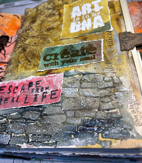
Here is another more realistic look at the bricks. Hard to see but there is silver in with the white highlights. They turned out so great! Love that Grit Paste. Well that is it for me. I hope you subscribe to my blog, You Tube, Facebook & Instagram. I post different projects on these platforms. Lots more content coming your way, including working in this book. Have a great day & hope you have a chance to get inky! For photos of Topflight Stamp products you can go here.
Supplies:
- Visible Image Stencil - Daisy, Daisy
- " " Stamp- The World Needs Art
- Carabelle Studio Stencil Stone Wall
- PaperArtsy Infusions
- " " Fresco Finish paint
- Seth Apter Emboss in Lime
- Wow Emboss in White
- Prism Ink in Roasted Coffee
- Phat Foam (to use with wax)
- Gel Press
- Brayer
- Eileen Hull Full Size Journal Book by Sizzix.
- Sizzix Luster Wax in Rose Gold & Silver
- Tim Holtz Grit Paste, & Crackle Paste by Ranger
- Tim Holtz Paper

I have a feeling that they are going to miss your creativity SO much Karen. I love this signature, my favourite part is that fantastic brick wall, it looks so realistic!
ReplyDeleteWishing you a very Happy Christmas and all the very best for 2022 my lovely friend. Hugs, Anne xx
Thanks so much Anne!! I wish all the best to you too. I hope 2022 brings you lots of health, family & fun!
Delete