Hello blog land- This week over on Stampotique the challenge is to do a one layer card. For those of you who know me I am the layer girl, the more the better-if it doesn't look good just keep adding until it does. This was a good challenge for me. Normally I would stamp on card stock & cut out the image than add them to my piece, but this is one layer. In order to stamp this super inked card I used a mask to create the space to stamp after the mists and inks were dry. I started with printed paper to add more dimension but not extra layers-aha! Finally I added stickles on the circles and Glimmer Glam on the hexagon to bring out the glitter Enjoy!!!!
A great place to learn about mix media, scrap booking & all things inky. Filled with tutorials to inspire you!
Sunday, August 26, 2012
Friday, August 17, 2012
Steampunk Box
My Moxie friend Suzie over at My Time To Play has become my submission manager-in other words she finds contests and blogs that suit my style and gives me great input on websites which I might like. This is a new site for me but I love it!!! http://snazzysdesignteamblog.blogspot.com/ they have great designs and ideas as well as a fabulous store to help my stamp addiction. Very exciting- they are having a steampunk contest so here is my submission: I hope you like it!!!!

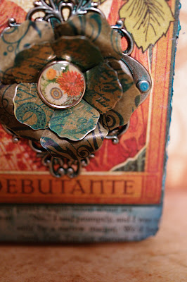
Here is one of my fav to date, my steam punk cigar box. Lots of Graphic 45 and Tim Holtz (TH) I am going to add a handle & turn it into a purse- or have it as a wall art, still undecided. There is a whole lot of details in this which I love-tons of stamping both obvious & subtle. Here are a few details:
I started with grunge clocks, (upper left corner) covered with decoupage glue & paper than once dry rubbed ink and stickles across them so they are sparkly fun.
I hand made the flower to match the colors of my box, adding feathers and a fabric brad. The little side flowers started as plain paper that were glimmer glazed and heat embossed gold around the edges.
Another detail is this G45 copper flower made special by stamping clocks, script & swirls in archival ink than adhering to a TH ornate plate that was colored with glaze.
In fact I feel so inspired by going through this process I may have to go make another one...
Wednesday, August 15, 2012
More Junk Journal
Summer is cruising along & I have less time to play. Trying to get in the family fun before school and fall sports start up. In my next post you will see the start of this vacation junk journal. Here are a few more pages. I am loving how this is just simple inky fun- getting the photos down even if sometimes they are a bit small.
Monday, August 6, 2012
Junk Travel Book
Traveling On vacation I really wanted to create some of my travel book while I was there. Part of vacation time for me is working on my personal projects & enjoying the freedom that creates. The inky goodness needs to be portable, quick and easy so I can snatch some me time in between vacay fun. I found this project on Ronda Palazzari's bloq & thought it was just perfect for my trip. Especially because I started it ahead of time, well the night before! This project has the junk book look & feel. Like Ronda, I also started with a moleskin book & covered it with the new super cool Trader Joe's recycle bag that had the perfect theme for my Florida trip! The cover will be finished last & I plan on using the handle from the bag as a wrap around closer strap. Here are the pages I have so far:
To print out the photos in the mixed sizes, I copied the photos to a publisher page & re-sized them and then printed them out. I tried not to get too picky about sizing & page layout just had fun slapping ink on the pages, printing in various sizes. The goal was to just have fun and get the memories on the pages!
I brought random ephemera, inks, stencils & stamps. My new favorite obsession is washi tape so I brought beachy colors & natural that I can color. You will notice the themes can be random-for example my beach page has Tim Holtz stamps on it from his bitty grunge set-not a fish in sight but I think it works as the ink colors are beachy. Same thing with my Imagine page- gears & bricks not so much association with the beach but to me it works because of the ink colors, just adds an edgy, cool feel to it. I had soooooo much fun playing in this book in fact I gotta go "spend travel recovery day" playing in it!!! Later!
Subscribe to:
Comments (Atom)


